Diving into users problems
Getting to know who a resident of Cracow is
To be able to properly design a solution tailored to this market, I first had to get to know who the Cracow resident is.
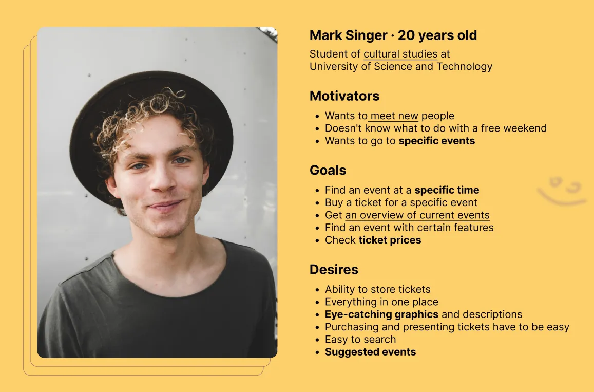
Based on mixed-methods approach I've created protoperon which helped me to define the required functionalities of the application
Based on mixed-methods approach I've created protoperon which helped me to define the required functionalities of the application
The best way to find out is by asking
The development of a quantitative research tool provided more detailed information on user needs.
Statistics are created after more than 100 responses.
Statistics are created after more than 100 responses.
63%
Wants personalized recommendations
65%
Indicates filtering as an essential element
>70%
Uses online ticket buying
>80%
Are interested in cinema & concerts
Let's see what the competition has to offer
Studying the competitors has allowed me to search for good solutions but also to find out what to avoid.
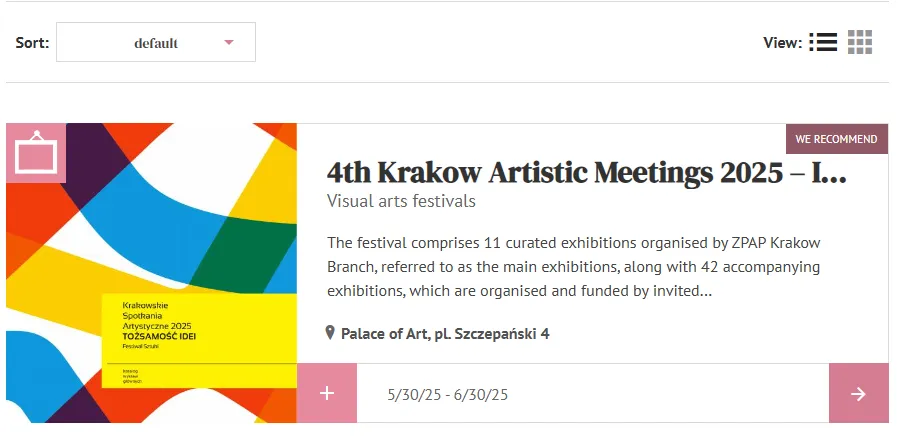
Good hierarchy of information
An easily scannable event card helps you find information about an event quickly.
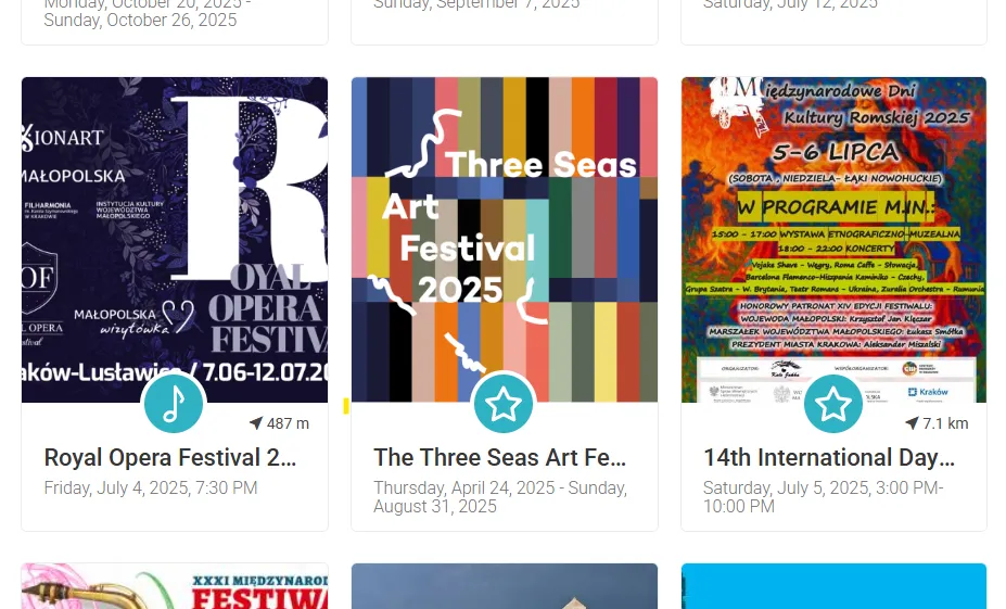
Omnipresent mess
Displaying too many elements on a page makes it difficult to focus on one event and find the necessary information about it.
Creating a tailor-made solution
Providing a flat information architecture
By minimizing hierarchy; categorizing events into 9 clear top-level sections and avoiding nested submenus the design achieved cognitive simplicity & scalable discoverability.
This approach transformed ticket purchases into a 3-step flow directly fulfilling user desires for "everything in one place" while accommodating future category expansion.
This approach transformed ticket purchases into a 3-step flow directly fulfilling user desires for "everything in one place" while accommodating future category expansion.
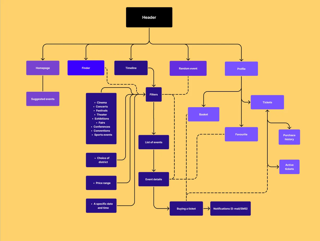
The most desirable functionalities first
Based on the information previously gathered, I was able to come up with a list of functionalities that will most help the user to succeed.
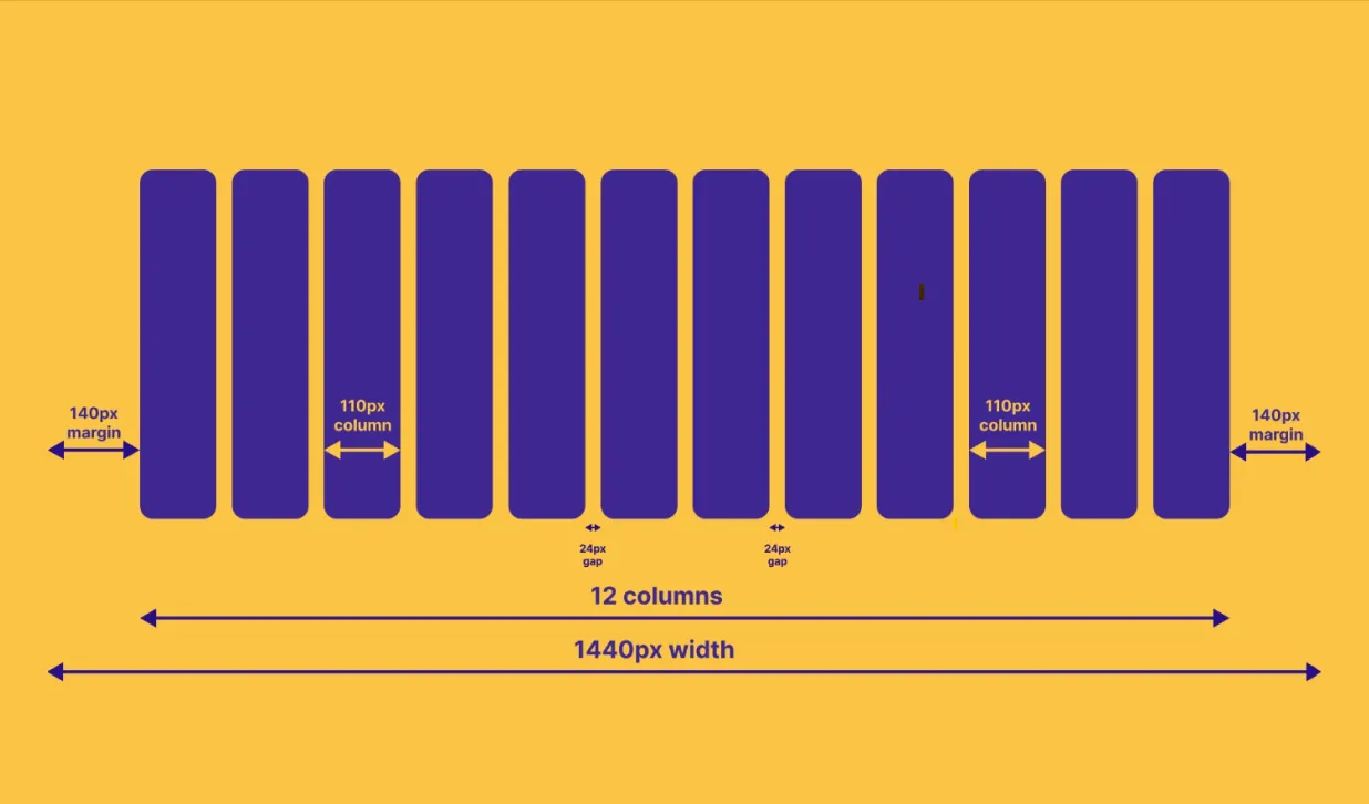
Logical layout for better readability
By applying a grid to the design, it was possible to increase the clarity of the site and allow specific, highlighted events to breathe better.
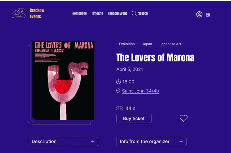
Ability to add to "favorites" event
Suggested events
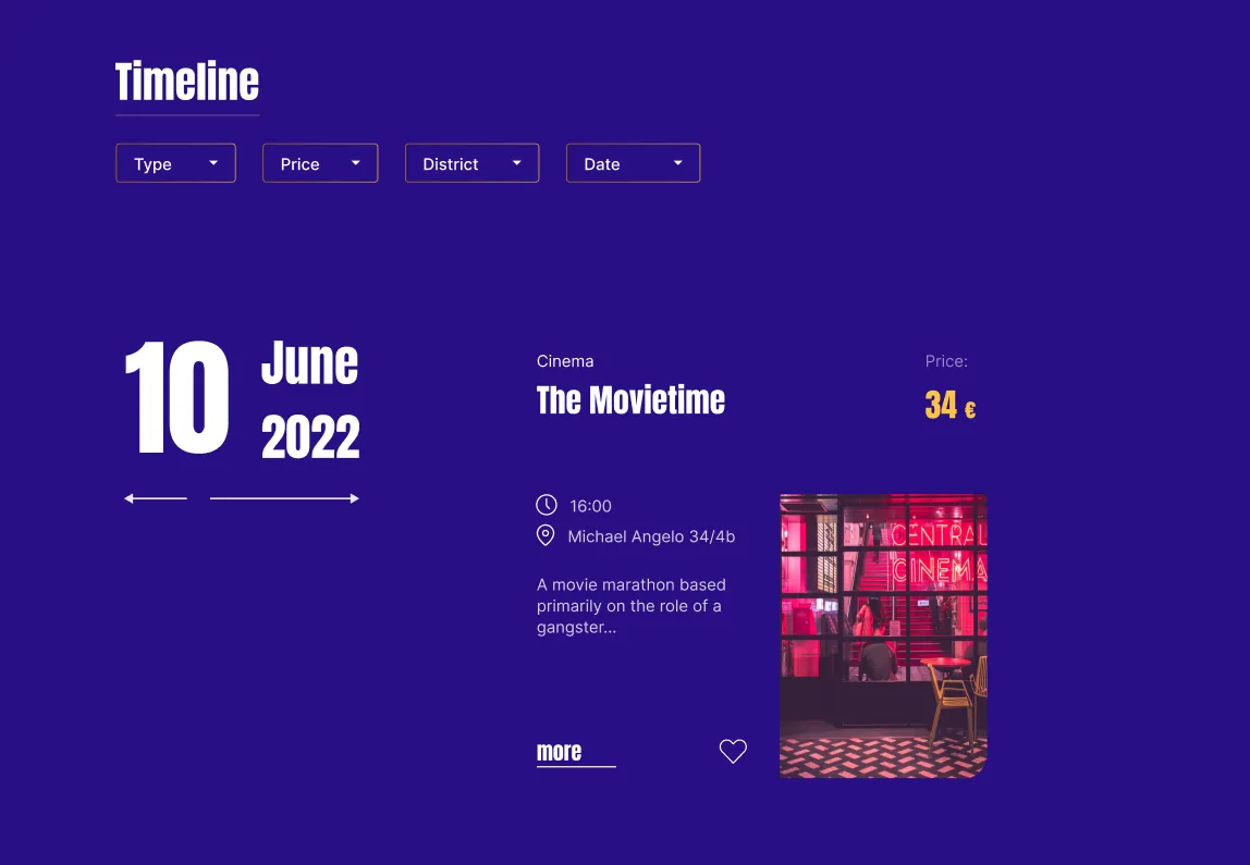
Powerful search and filters
Date, cost, location, subject immediately visible
Translating requirements and conclusions into Figma
Eye-catching homepage and simple navigation
Thanks to the results of the survey, it was possible to solve the main problem of users, which was that the categories were too overwhelming, and to give events the main stage.

All you need to go out
By building an appropriate hierarchy of information, it has been possible to simplify navigation between events.
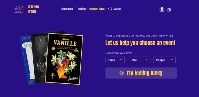
Additional features such as a timeline and the selection of a random event by criteria help to make a decision shaped to the user's needs.
Additional features such as a timeline and the selection of a random event by criteria help to make a decision shaped to the user's needs.
